A nice-looking website and a website that sells are two different disciplines. You can spot the first at a glance, the second only at the end of the month. And because websites get judged by eye, it’s almost always the first one that gets fixed: the buttons get new colors, the photos get swapped, the font gets bigger. The number of inquiries stays the same.
This is the situation I see most often with clients. They come in saying the website is new, cost decent money, everyone likes it, and nothing comes of it. When we then go through the page through the eyes of someone who knows nothing about the business, an awkward silence follows. The design is fine. The path is missing.
A website sells along the whole path, not in one spot
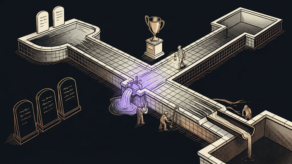
The button is only the last step. An inquiry builds up gradually, along the path from the first second to the submitted form, and it takes just one break along the way for it to fall apart. That’s why asking whether a website is good makes no sense. The useful question is where exactly people leave it.
And the most common flaw is vagueness rather than ugliness. Within a few seconds, the visitor can’t tell whether they’re in the right place, so they go elsewhere. They don’t get annoyed, and they don’t write to you. The tab simply closes, and you never find out.
Conversion path
The sequence of steps from the first page view to a submitted inquiry. Every step loses some people, even when it’s done well. Nobody gets 100% of visitors through, so the goal is different: find the one spot where far more people drop off than anywhere else, and fix exactly that.
Visitors leave because they have no idea what to do next, not because they dislike what they see.
The first screen: who you are, who it’s for, and what they get
Every single person who comes to your website sees the first screen. That’s exactly why it’s the most valuable real estate on the whole site, and also the most often wasted. It usually holds the company name, a big photo, and a slogan that tells you nothing at all.
Four things belong there, all in plain language. What you do. Who it’s for. What the visitor gets out of it. And what they can do right now. If any one is missing, the visitor fills it in themselves, and they usually guess something different from what you meant.
A one-minute self-test
Show the first screen of your website to someone who knows nothing about your business. Let them look for five seconds, then cover the screen. Ask them two things: what the company does and what it wants them to do. If they hesitate, the problem isn’t theirs.
One next step, not six options
Every page should offer one next step. Three side by side is already too many, and six is far worse. When you give people a choice, what they most often choose is to leave, because deciding is work, and nobody’s paying them for it.
The best next step is usually the smallest one. For services, that’s typically a booking link where people pick a time themselves, not a form with eight fields and a required phone number. The sooner an anonymous visitor turns into a concrete appointment, the fewer chances they have to leave along the way.
What slows visitors down
Anything that adds extra work between the decision and the action. A form field nobody needs. Having to dig up your company ID number. The line “we’ll get back to you as soon as possible,” which doesn’t tell you whether that means an hour or a week. You don’t see it yourself, because you know your website by heart.
What happens after someone hits submit matters just as much. If people only see a gray “thank you” message, they’re left uncertain at exactly the moment they trusted you most. If the form immediately produces a finished document, or at least a concrete confirmation with a date, it looks like a business that has its act together.
In what order to fix things
You fix things according to how many people pass through each spot. That’s all there is to the rule, and it’s surprisingly ruthless. Everyone sees the first screen, so one fixed sentence there has more impact than three days of fine-tuning a page that only a fraction of people ever reach.
The order is almost always the same. First, a clear first screen. Then one obvious next step. Then proof, meaning concrete examples and references instead of general promises. Only then the form and its length. And design comes last, even though that’s usually where people start.
How I rank fixes
I score each flaw with two numbers: how many people it affects and how much it stops them from continuing. The product decides. That way, I never end up starting with a detail on a page almost nobody opens. And above all, it shows when further fixes are no longer worth it.
It’s practical to keep fixes together with where they lead. When the page, the form, and inquiry tracking all sit in one place, you see right away whether a change worked. Deployment itself is no longer a bottleneck either, because a change goes live with one prompt, not through an order and waiting for someone to have capacity.
Who it doesn’t pay off for
Who is this not for? If you don’t send anyone to your website, there’s nothing to measure and nothing to fix. A page without visitors is just an empty room, not a bad page. There, you start with visibility, not with the order of buttons.
It also doesn’t pay off where there are so many flaws that the fixes would get in each other’s way. In that case, it’s cheaper to build the website again, based on how people actually make decisions. These days, a new version can be built from a business description by evening, so a rebuild stopped being a six-month project long ago.
The whole audit in a nutshell
- Go through your website as a stranger who knows nothing about you.
- On the first screen, find four answers: what, for whom, what’s in it for them, what next.
- On every page, find one next step. Remove the other offers.
- List the flaws, and for each one, work out how many people it affects and how much it stops them.
- Fix them from the top down by that product, not by whatever caught your eye first.
- After each fix, check whether inquiries have moved. Then keep going.
Back to that awkward silence when we go through a website together. What it reveals is almost always a page that makes no sense to someone who doesn’t know what you know about the business. Ugliness rarely has anything to do with it. A nice-looking website shows what you can do. A website that sells shows what the other person gets out of it.