Most people associate business documents (an event invitation, a seminar schedule, a one-page brief for a client) with an hour in Canva and the feeling that the result looks like someone else made it anyway. Yet the design is just the packaging. You send the document because you need to say something, not because you enjoy aligning margins. And today you can hand all that design grind to AI and keep just one thing for yourself: deciding what goes out.
It’s a quarter past ten at night, and you need an info sheet for an event tomorrow. You open Canva, drag a text box two millimeters to the left, the headline spills onto a second line, the image won’t fit in the corner. After a while, you have something on screen that looks almost right. And that “almost” will eat at you all evening, because you know you’re putting your name on something that doesn’t match how well you actually do your work.
Why a generic PDF looks cheap
A client spots a generic document at first glance, even if they can’t say why. It looks like an internet template they’ve already seen twenty times: a font that doesn’t match anything, colors picked by eye, a layout with too much space in one place and cramped text in another. There’s no trace anywhere of a specific business with a specific face behind it.
The catch is that you start every one of these documents from scratch. You pick the font again, hunt again for the blue you used last time, adjust the spacing again. Your brand is supposed to look the same every time, yet you piece it together by hand every time: tired, in the evening, in a hurry. No wonder the result looks random.
What makes a document premium
A document is premium when the client recognizes you before reading a word, however many or few hours went into it. That comes from brand consistency: the same font, the same colors, the same layout, and text that sounds like you, not like a corporate template.
Brand consistency
Brand consistency means every document that comes from you looks like it came from one person: the same font, the same colors, the same layout, and the same tone of voice. It lets clients piece your brand together without thinking about why. Consistency is exactly what separates a business that looks expensive from one that sends a different template every time.
Clients remember your brand from the fact that every document looks the same, not from any single one.
The one-minute self-test
Take the last document you sent out: a quote, an invitation, a brief for a client. Would a client recognize your brand on it blind, just from the font and colors, or is it a generic template that a thousand other businesses use too? The answer tells you whether your documents work for you or just fill space.
One sentence instead of an hour in an editor
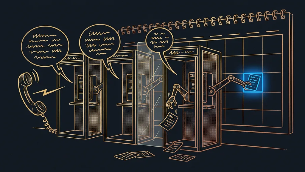
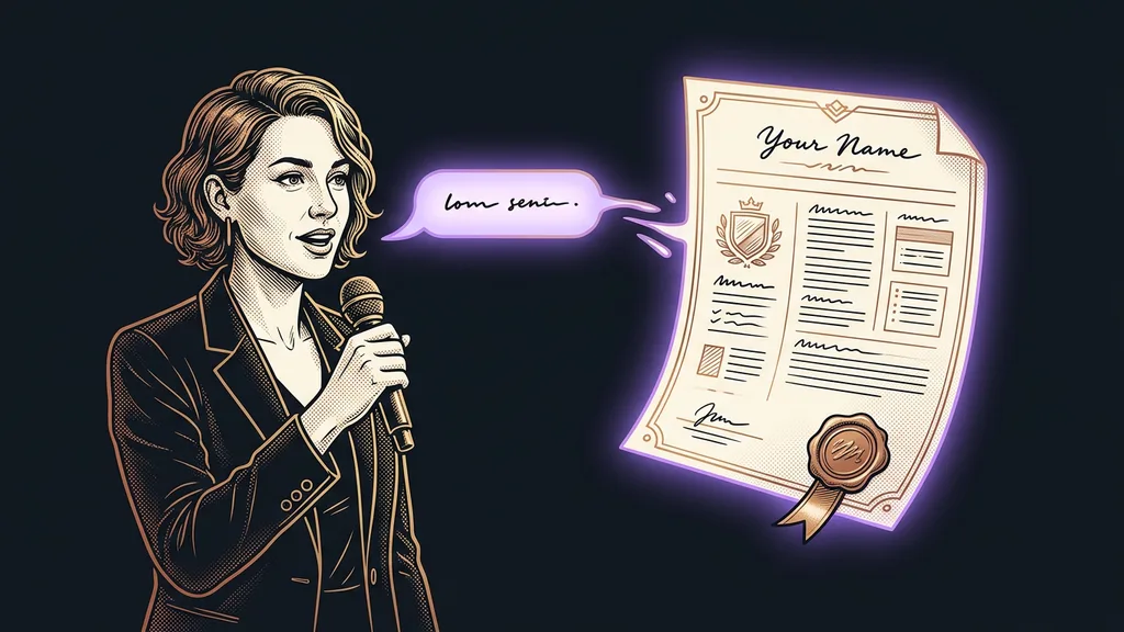
The turning point came when I stopped opening the editor. I say one sentence, or just dictate it (“make an invitation for the weekend seminar, this date, this price”), and I get back a finished PDF in my design. What comes back is a finished thing I can send right away, rather than a template I’d still have to polish.
And it handles the whole family of documents you need most often in business: an event info sheet, a seminar schedule, an invitation that looks like an invitation rather than a plain email, a team introduction, and a small brochure. My price quotes have their own, even more elaborate template.
There’s no magic under the hood.
HTML → PDF pipeline
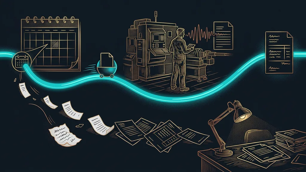
An HTML → PDF pipeline means the document is created as code instead of in a design editor. Claude Code writes a page in HTML, the same language websites are built with, fills in your colors and font, and uses a browser without a window (a headless browser) to lay it out as a finished PDF. Whatever is described once in code looks the same every time: no more nudging text boxes two millimeters by hand.
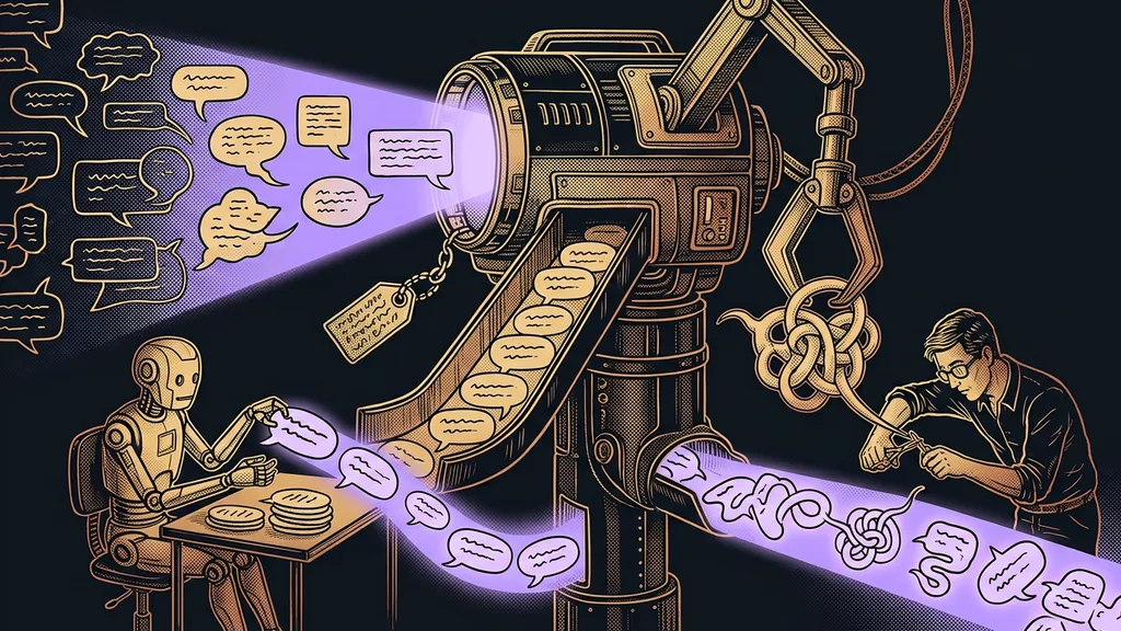
And the most valuable part for me is that the text doesn’t sound like a template. The AI knows my voice, so the document speaks as if I’d written it myself. It stays clear of corporate phrases like “in today’s fast-paced world.” My design is saved, so the result holds together, whether it’s an invitation or a team introduction.
What I still fine-tune and what I don’t
I’ll admit the limit up front: it’s not true that I never touch the document. Now and then I fine-tune small things: I swap a sentence, cut a line, reorder paragraphs. What’s gone completely is laying it out from scratch and that endless clicking through at the end to check whether text overflowed somewhere and whether the colors and font match my brand. They always do, because they’re described in code, not assembled by hand.
Mostly, what I got out of it is peace of mind. For the first time, I know for sure that everything I send out looks like one consistent set, not like five different documents from five different people.
Who it isn’t worth it for
If you send out one flyer a year and have a Canva template that works for you, it’s not worth building this system for it. A ready-made template costs you a few minutes, and you don’t have to think about it any further. It makes sense once you send documents regularly and care that they look like one set: quotes, invitations, client briefs, team introductions. The more of them you send out, the more it pays to have them look the same every time.
The whole system in a nutshell
- The AI knows my brand: font, colors, layout, and my voice.
- I say or dictate one sentence: which document and what goes in it.
- Claude Code builds an HTML page from it and uses a headless browser to lay it out as a PDF.
- The document arrives finished, in my design and in my words.
- I read it, occasionally fine-tune a detail, and send it.
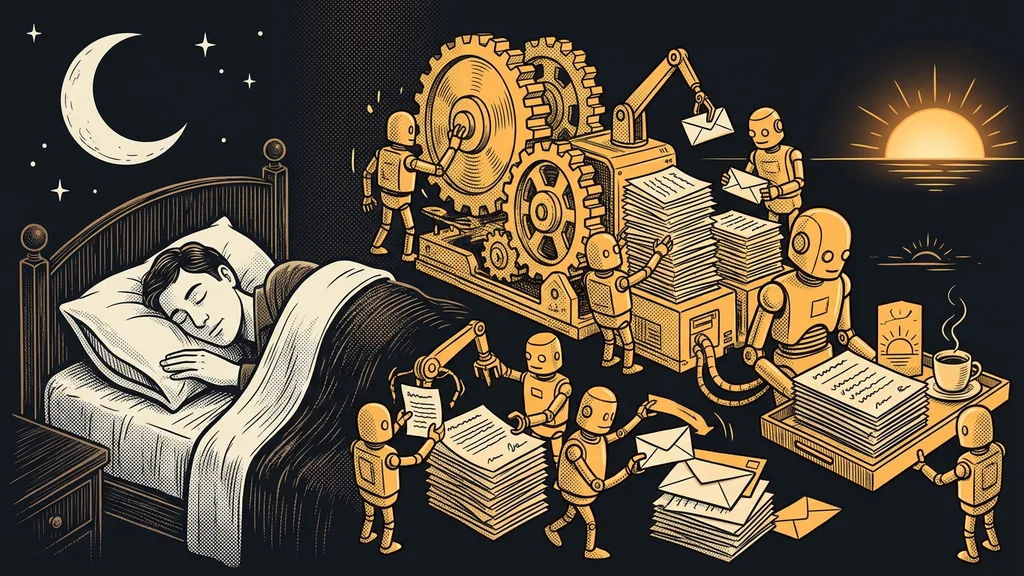
So what about that quarter past ten at night? These days I write one sentence and go to bed, and the finished PDF is waiting for me in the morning. You recognize a premium document by the fact that it looks like you, the same way every time, not by how many hours someone spent on it. And the “almost right” that ate at me for years has finally turned into “exactly right.”