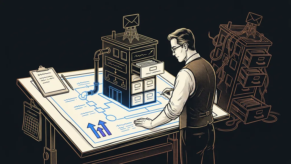
A booking confirmation and a reminder the day before a meeting are among the most-read emails you’ll ever send. Almost everyone opens them, because they mean something: when we’re meeting, where to log in, what not to forget. And yet most companies send them exactly as they came out of the platform: gray, cramped, in someone else’s font, with the name of some software in the footer. Your most-read message, and the only one you never touched.
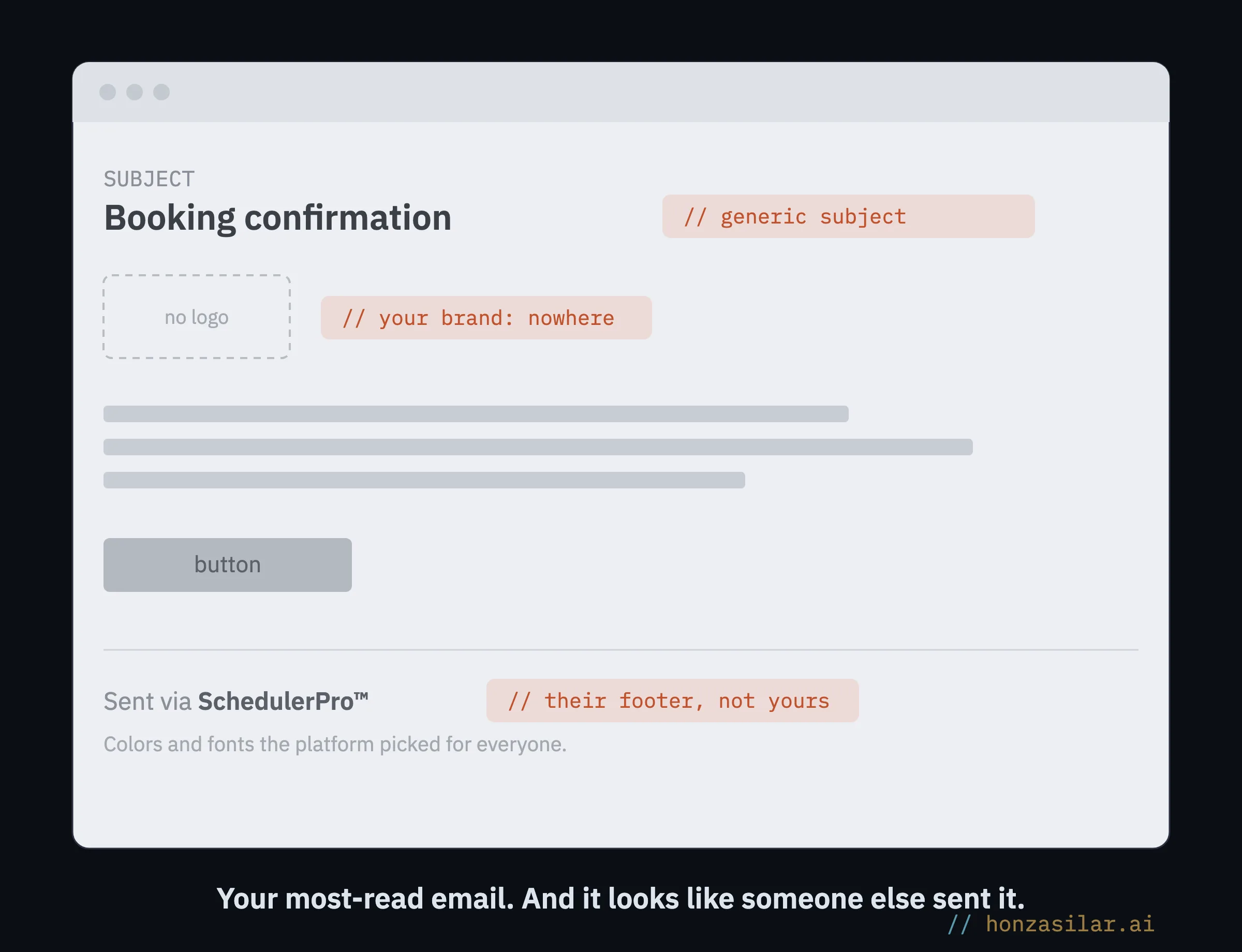
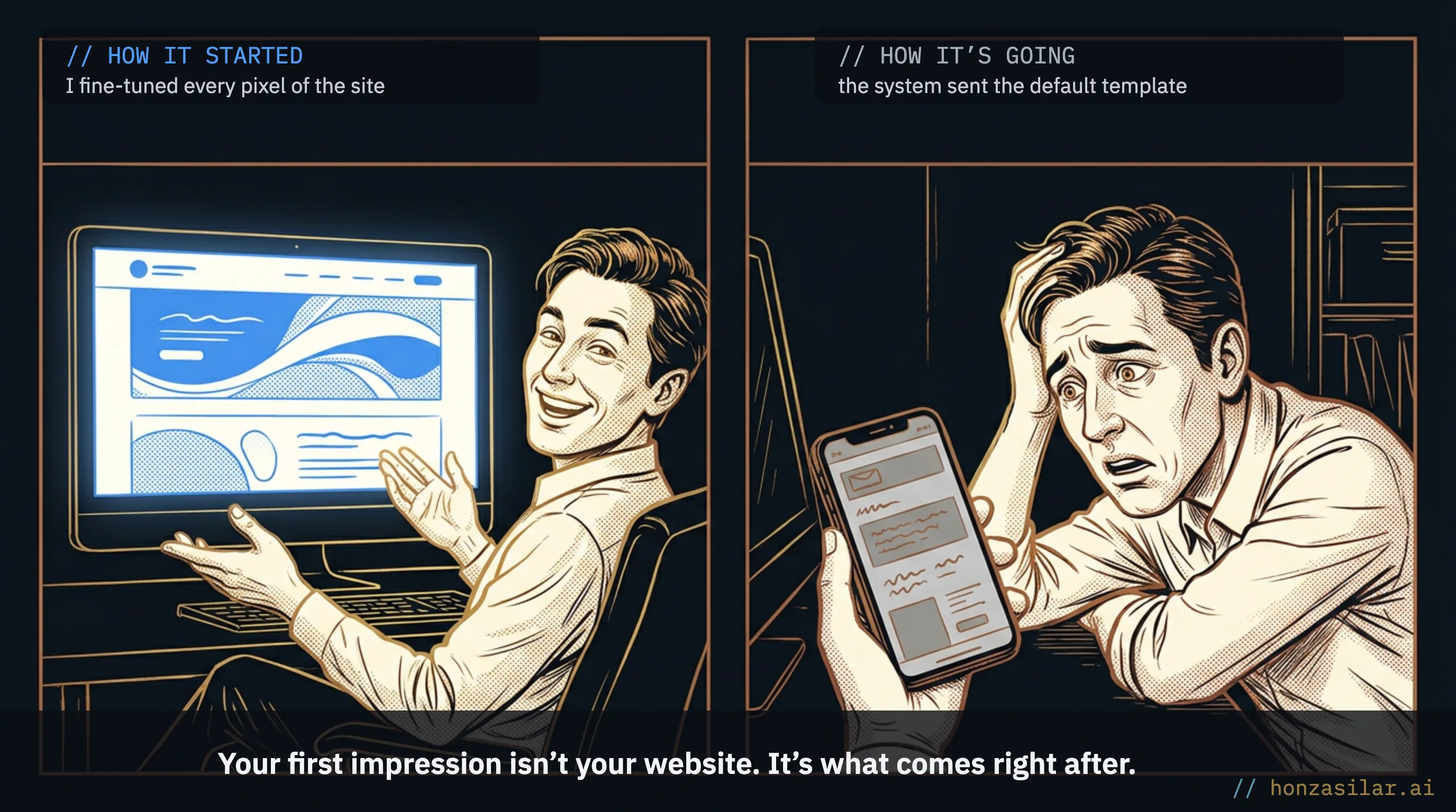
I know this from experience. I built a website for a client, fine-tuned every pixel of the booking form, and then found that the automated confirmation the system sends on my behalf looked as if someone else entirely had written it. For a while, I ignored it. It’s just a system email, after all. Until one client wrote to tell me the confirmation had landed in spam, and it dawned on me that the detail I kept ignoring is seen by every single person who books anything with us.
What gives a factory-default email away
You can spot a factory-default email at first glance, and more importantly, so can your client. It gives itself away with a few small things they might not be able to name, but they’ll sense them.
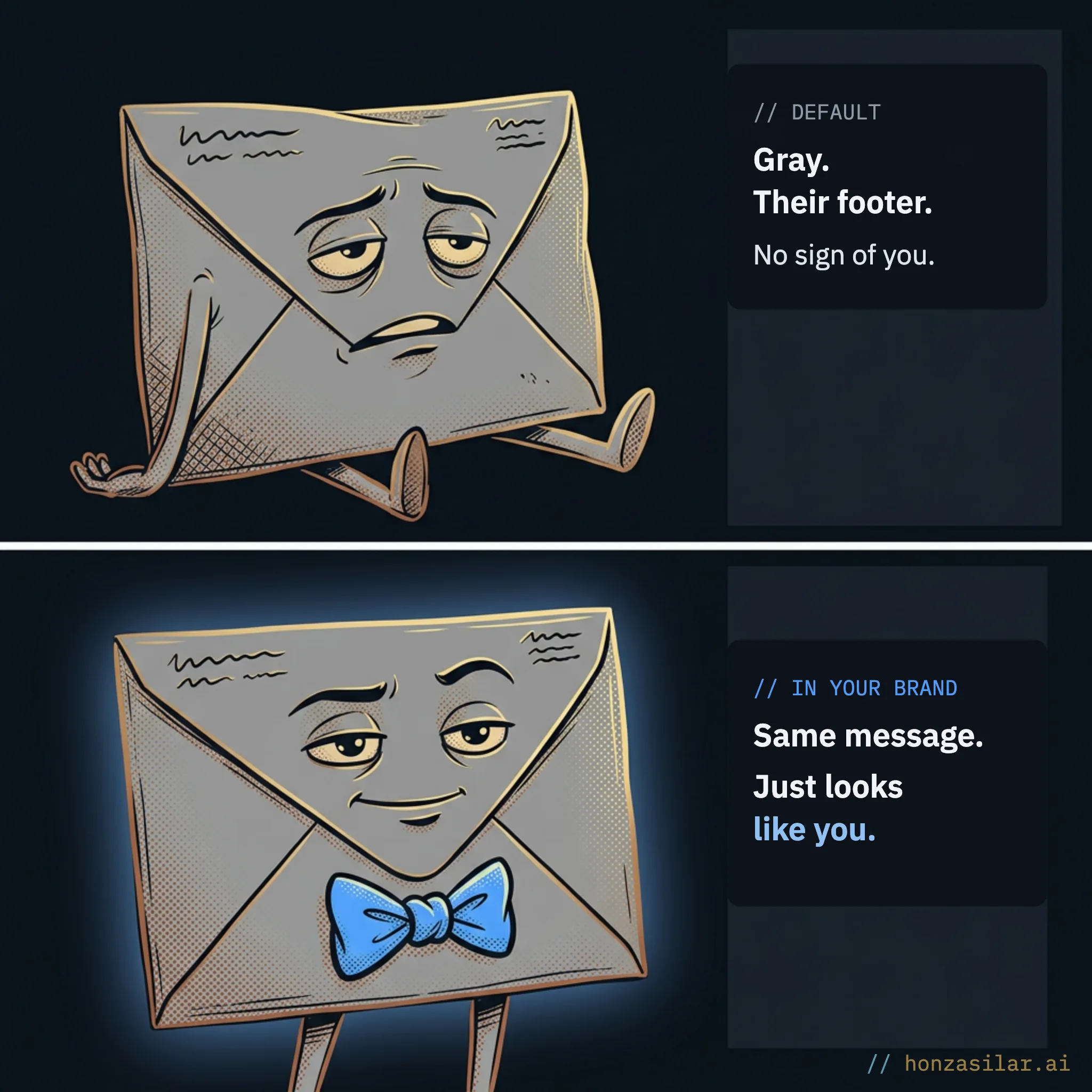
Default email × email in your brand
| Element | Default template | In your brand |
|---|---|---|
| Footer | the platform’s name | your name and signature |
| Logo | none | yours |
| Subject | “Booking confirmation” | yours, one that draws people in |
| Colors and fonts | someone else’s, from the platform | yours |
Transactional (system) email
A message the system sends on its own in response to something a client does: a booking confirmation, a course welcome, a reminder before a meeting, a password reset. Nobody writes it by hand, and nobody reads it beforehand, because “it runs by itself.” That’s why it stays in its factory-default form, even though it’s often the very first message someone gets from you.
One-minute self-test: read your last confirmation through your client’s eyes
- Is your logo in the email?
- Can you tell from the footer that it’s from you, not from the platform?
- Would the subject line draw you in enough to open the message?
- Do the colors and fonts match your website?
- Does the message feel like you, not like spam from 2010?
Why these messages in particular make the difference
They make the difference because people actually open them, and they open them right after deciding to give you a chance. Up on the website: careful work, colors, tone, personality. A second later: an impersonal template with nothing of you left in it. Your client won’t name the contradiction, but they’ll sense it, and the trust you were building a moment earlier gets its first scratch.
Empty appointment slots and evenings at the screen
The most treacherous part is that it happens quietly. Nobody will write to tell you “that confirmation looked cheap.” You still pay the price; you just don’t see it in one place.
A reminder that looks like spam gets overlooked, and the person doesn’t show up for the meeting. A faceless welcome email doesn’t draw anyone into a course. A message missing both a logo and a signature is harder to trust, exactly where trust matters most.
You pay for a factory-default email with empty slots in your calendar and an impression that’s hard to make up for.
And there’s a second cost: your own work. Rewriting every template by hand, fine-tuning the colors, coming up with a subject line that actually gets people to open the message: that’s an evening at the screen nobody sees. That’s why most people give up by the third template and leave the rest the way it came out of the factory.
Three myths about system emails, and the reality
The way out
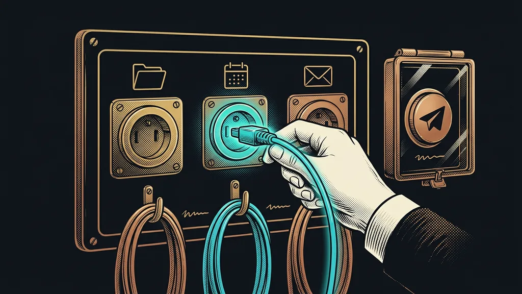
There’s only one way out: tell the system once what your brand looks like and how it talks, and let it dress every email in that look on its own. Colors, tone, logo, signature. The gray factory template becomes a message that looks as if you wrote it yourself.
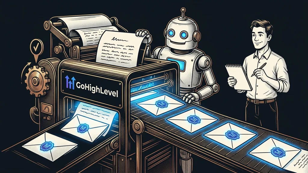
I built exactly that kind of system on top of GoHighLevel. It takes any system email, whether it’s a booking confirmation, a welcome for a new student in a course, or a reminder from an automated workflow, and rewrites it in your brand. It also prepares the subject line and preview text while it’s at it.
Preview text
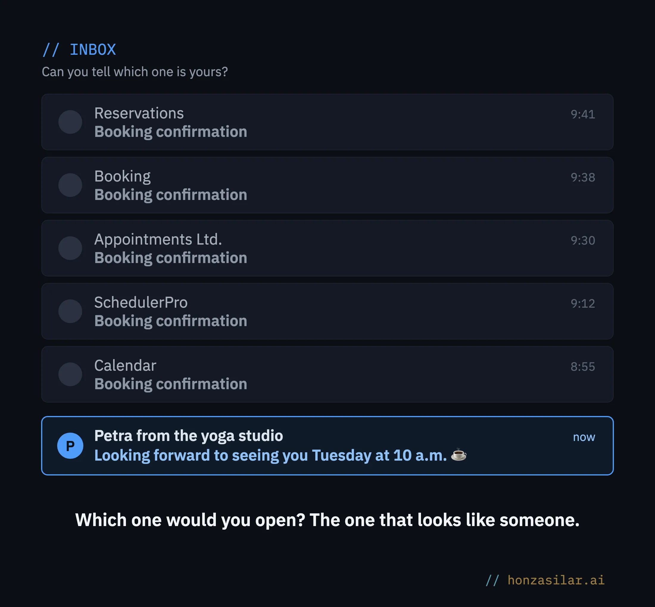
The short line that shows up in the inbox right after the subject, before you open the message. The platform pulls in the email’s first sentence by itself, so it usually shows something like “If this email isn’t displaying correctly…” instead. Yet the subject and the preview text together decide whether anyone opens the message at all.
I’ll keep the exact recipe for how the system matches your brand to myself. The principle is simple, though: the brand gets described once and is then held across everything that leaves your business, just like the company documents the system produces in your branding. You just take a look, approve, and you’re done.
What you get
Every automated email the system sends on your behalf looks like you, and you didn’t have to be there for it. One consistent impression from your website down to the footer of a confirmation, and a first handshake you finally have under control.
Who it isn’t worth the trouble for
Frankly: if you send one or two automated confirmations a month and have only a few clients, branding your system emails is like printing letterhead for two letters. You can rewrite one template by hand in an afternoon and be done with it.
When branding system emails pays off, and when it doesn’t
Worth it
- The system sends dozens of messages for you.
- You have courses, bookings, and reminders.
- Email is often the first thing a new person sees of you.
Not worth it
- You send one or two confirmations a month.
- You have only a few clients.
- You can rewrite one template by hand in an afternoon.
And where dozens of messages go out, the difference between “looks like you” and “looks like spam from 2010” counts every single time.
The whole thing in a nutshell
- You describe your brand to the system once: colors, tone, logo, signature.
- It takes every system email from GoHighLevel and dresses it in that look.
- For each message, it also prepares the subject line and preview text, not a generic “Booking confirmation.”
- You take a look and approve. Nothing goes out without your nod.
- From then on, every confirmation, welcome, and reminder goes out in your brand automatically.
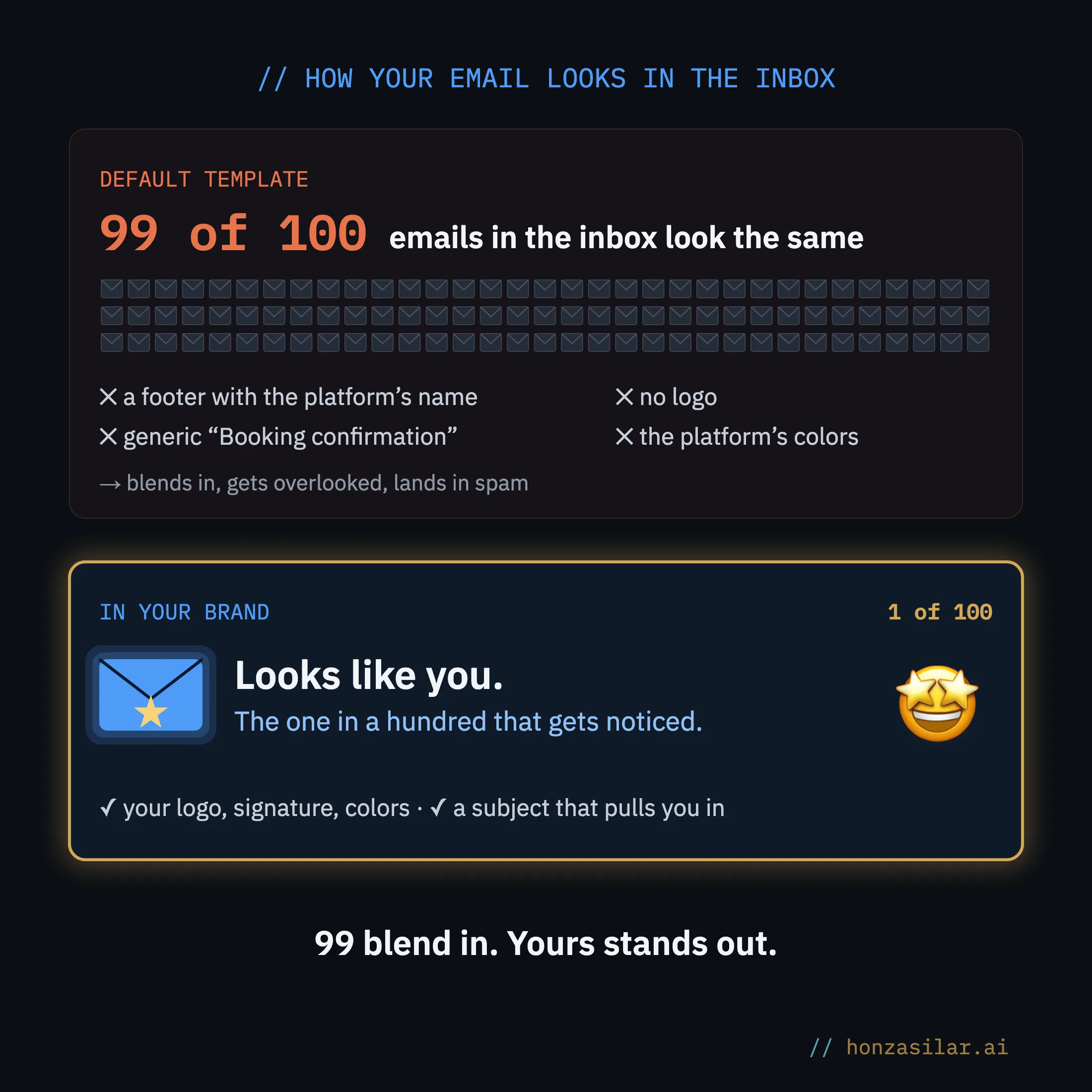
So the next time someone finds you, looks through your website, and books a call, that first message in their inbox won’t look like spam from 2010 anymore. It’ll look like you. And since it’s also the most-read email you’ll ever send, that’s exactly how that person will remember you.