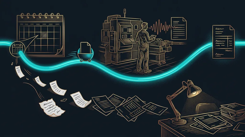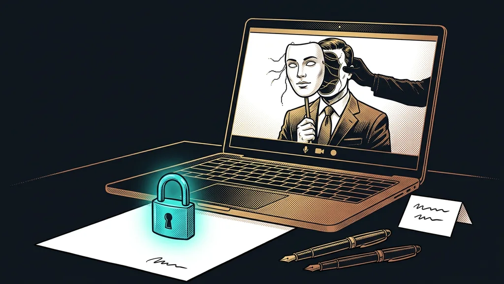
The cookie banner is the first thing every visitor sees on a website. For most companies, it’s also the only element nobody designed. Up pops a gray rectangle with someone else’s logo, someone else’s font, and text that even the person who put it there doesn’t understand. And that’s what people look through to see a website you put six months of work into.
I hear it again and again in consultations. The font, the shades, even the corner radius of the buttons were fine-tuned, and then a panel from a completely different company sits on top of it all. The owner usually doesn’t even see it as theirs. They treat it as a mandatory sticker some government office slapped on their website.
Your cookie banner is the first sentence of your website
The consent banner is actually the first thing your company says to a visitor. And because absolutely everyone sees it, it reaches more people than any page. How you behave in that moment shapes their picture of you before they’ve read a single headline.
It’s the same story as the system emails a platform sends out in their factory-default form. A small thing nobody bothers with, and yet every customer sees it. The difference between “looks like it’s from them” and “looks like it’s from you” takes a few hours of work and lasts forever.
Dark pattern
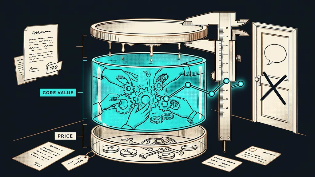
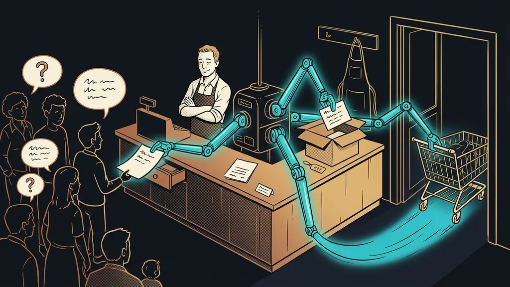
A design trick that nudges people into a click they didn’t want. A big colorful accept button next to a gray “settings” link tucked under the text. It works until someone notices. Then it comes across exactly as it looks: like you don’t care about the person on the other side.
Consent you tricked someone into clicking doesn’t count. What you actually got is one extra click, and you paid for it with their trust.
Rejecting has to be as easy as accepting
This is the basic rule, and also where people get it wrong most often. Both options belong on the same level of the banner and should carry the same weight. Consent up front and the reject option buried in the third layer of settings: that’s exactly the practice that makes people hate cookie banners.
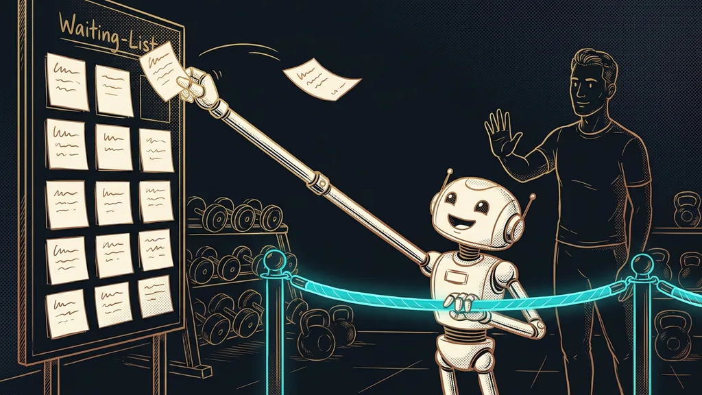
On my site and my clients’ sites, I go one step further. If anything on the banner is highlighted at all, it’s the reject option, never consent. It looks like working against yourself, and that’s how most people hear it the first time I explain it. But the cost is tiny, and you gain something money can’t buy.
A visitor reads exactly one thing from the banner: whether you’re trying to outsmart them or not. When they see that rejecting is easier, they stop looking for the catch. Few companies do this, so people notice. And you only lose data from people who would have declined anyway.
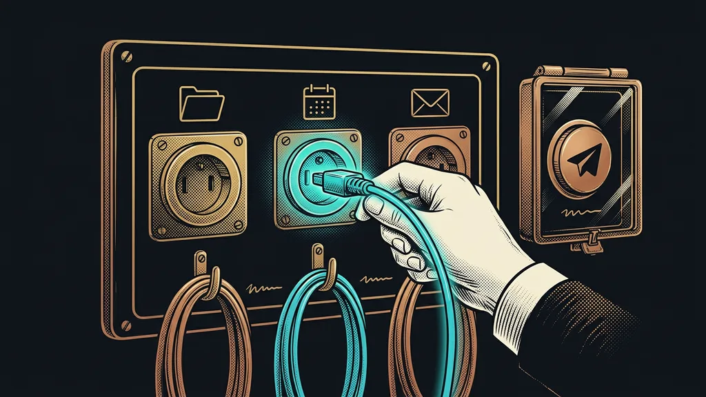
A banner that talks to your analytics
When someone declines consent, you still measure, only in a way that doesn’t remember the person. You keep the trends, traffic sources, and counts, just without details about the specific visitor. And the difference between “we measure nothing” and “we measure anonymously” is huge.
Consent mode
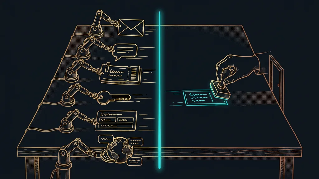
An agreement between the consent banner and your analytics tools about what they may do before the click and what after it. Without consent, they send only an anonymous signal with no identification; with consent, the full data. That way your reports don’t end up with a blank spot, and nothing gets stored before the person allows it.
Some measurement can also be built so it doesn’t need consent at all. A typical example is your own short links, which only count clicks and store nothing about the person. So with campaigns you know what works, even if half the people decline.
One-minute self-test
Open your own website in a private window and try to decline consent. How many clicks did it take? Was the button as visible as the other one? And did the banner come back even though you’d already decided? If you hesitate on any of these, you have something to fix.
On-brand, and without another subscription
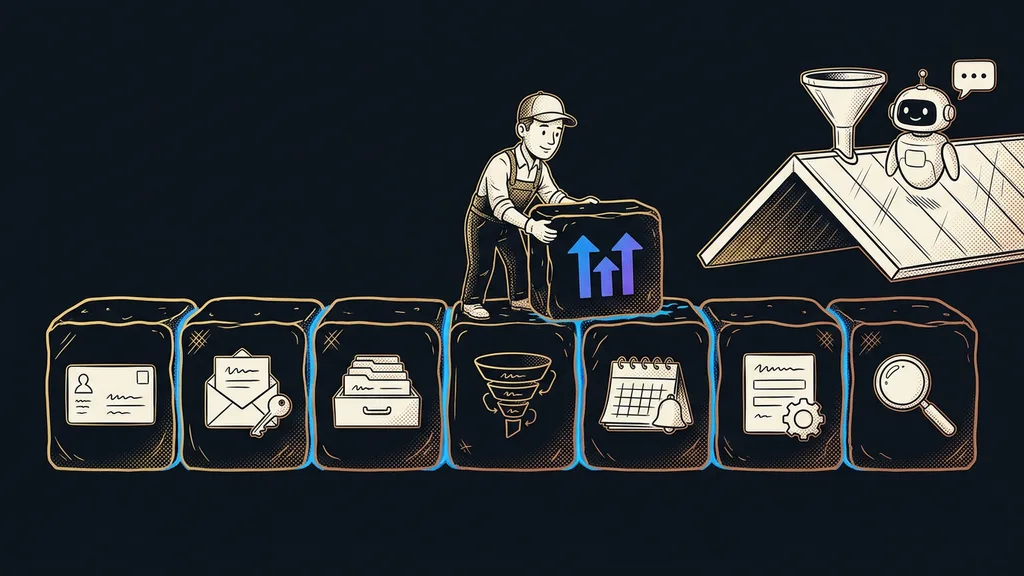
A custom banner is no big deal: a bit of code deployed along with the rest of the website, which these days gets built with a single prompt. It takes on your font and your colors and speaks your language, so no other company’s brand peeks out of it. A few hours of fine-tuning, and then it just runs.
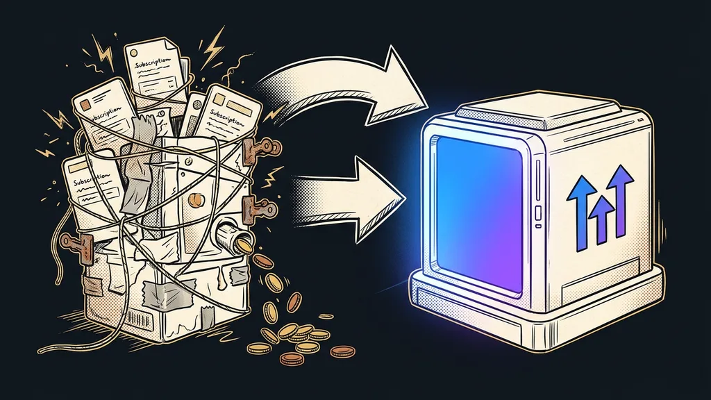
Ready-made services make sense for large websites dealing with dozens of countries and regular audits. For a small business, it’s mostly one more monthly payment on top of the ones you already have. Sales pages are where the banner gets forgotten most often, because a page with a form is often built separately from the main website, and the banner never makes it there.
Caveat
This isn’t legal analysis, and I’m not a lawyer. I’m describing how I do it on my own site and for clients who run an ordinary business website with analytics and forms. For an online store with third-party tracking codes, or for a website outside the European Union, it’s worth talking it through with someone who knows the subject professionally.
Who doesn’t need this
Who is this not for? If your website is just a business card, without analytics, forms, or ad tracking codes, there’s nothing to sort out. Strictly necessary things don’t need consent, and a banner would just be extra decoration.
It also won’t pay off if you expect a custom banner to let you measure more than everyone else. That’s not how it works, and it shouldn’t be. A custom banner is about looks, clarity, and peace of mind, not about getting around the rules. If you’re looking for a way to ask less conspicuously, you’re better off sticking with a ready-made solution and its accountability.
The whole banner in a nutshell
- Nothing that isn’t necessary for the site to work gets stored before the person clicks.
- Accepting and rejecting are equally easy, both on the first level.
- If anything is highlighted, it’s the reject option. Never consent.
- The choice is remembered and can be changed at any time without searching for it.
- After a rejection, analytics tools keep running, just anonymously and without identification.
- The look and the text are yours, not the factory default, and they’re deployed with the rest of the website.
Back to that gray rectangle with someone else’s logo. Nobody stuck it on your site as an official stamp. It’s the first sentence your company says to a visitor, and you choose how it sounds. An honest banner costs next to nothing, and it’s seen before anything else you’ve polished on your website.