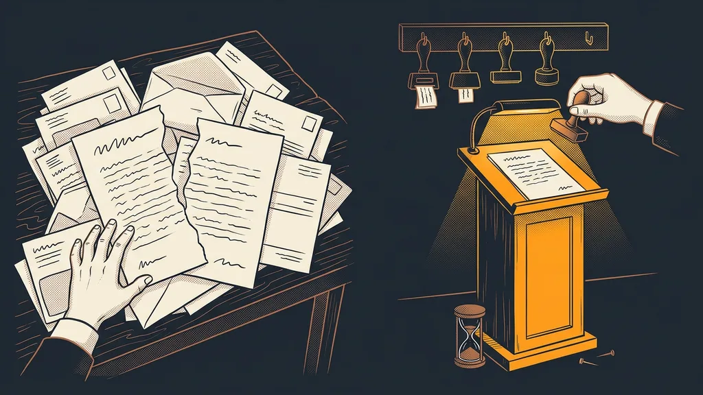
Approving finished work tends to be the slowest part of the whole project. A draft gets made in an afternoon and then sits for a week in someone else’s inbox, among invoices, invitations, and insurance offers. By the time the client gets to it, they don’t remember which version they saw last.
I know this from both sides. I used to send drafts by email, three images attached and three questions below them. One sentence came back: “Yeah, great, just do the second one a bit differently.” And then I had to guess which second one, and what “a bit” meant.
Clients decide fast once they know where to decide
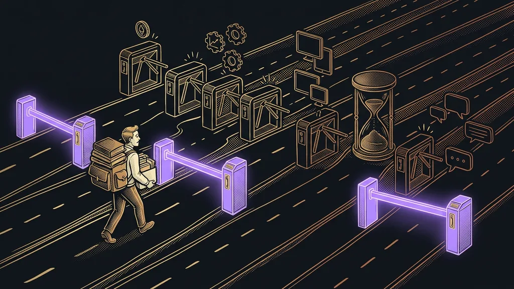
Clients can make decisions quickly. The hard part is finding what the decision is actually about and having all of it in front of them at once. The draft comes by email, a comment in a reply, the revised version in another attachment, and the approval somewhere halfway down the thread.
The approval gap
The space between a finished draft and its publication. The work is done, but it sits and waits for one human yes. You won’t see it on any to-do list, because formally you’re not working on anything. You only notice it because deadlines keep slipping and nobody can say why.
Nudging won’t close this gap. What closes it is one place where everything waits for the client, plus a few options for what to do with it.
Clients stall because we send them work to the same place where everything else lives. Unwillingness to decide has little to do with it.
One page where everything waits
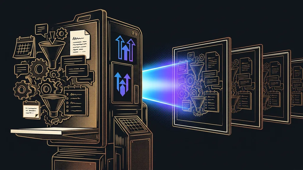
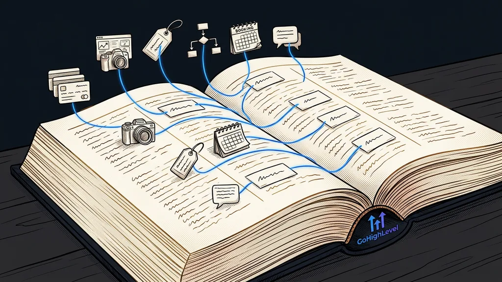
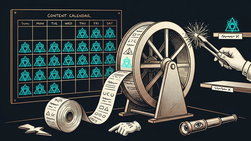
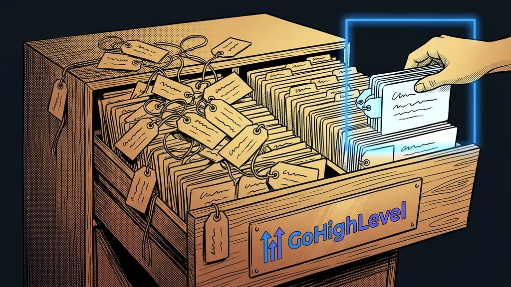
A client approval app is a plain list at its own address. It holds everything that’s waiting for a single decision: the text of an email, a graphic, a posting schedule, and a price quote as a PDF. There’s nothing else there, so there’s nothing to get lost in.
Each item has three things: a title, one sentence about what the client should look at, and a live preview. An email renders as an email, a graphic as an image. The client doesn’t download anything or open it in another app.
Building a place like this isn’t a big deal these days. It deploys the same way as a small website, meaning in an afternoon and at your own address. I’ve built it twice so far, and in one team, seventy-four items have gone through it.
Four buttons, and the whole difference lies between two of them
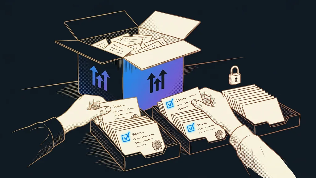
The client chooses from four actions and doesn’t need any more:
- Approve. It goes out as it is.
- Revise and approve. The client notes what to change, and the edited version goes straight out.
- Send back for revision. They want to see it once more before it goes out.
- Comment only. They ask a question or think out loud but don’t decide. The item keeps waiting.
The difference between the second and third options matters more than it looks. In one case, the client is saying “do it my way and send it”; in the other, “I want to see it again.” Mixing them up means either pestering the client for nothing or going around them. There’s nothing in between.
Human in the loop
A way of building a system where the machine prepares absolutely everything, but a person takes the last step. Sending, publishing, paying. That single step separates an assistant you trust from an automation you’d rather sit next to and watch.
One-minute self-test
Take the last thing that went out under your name. Try to find out within a minute who approved it, when, and whether they approved the final version. If all you can come up with is that “they sort of agreed on it over email,” you have your answer.
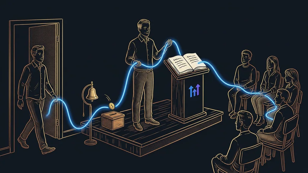
The most valuable thing about the whole app, though, is peace of mind on both sides, even more than speed. The client knows nothing gets published or sent without their click. I know where I stand, because every item shows who decided and when. No more guessing whether she approved it in that email back then or just said she’d take a look.
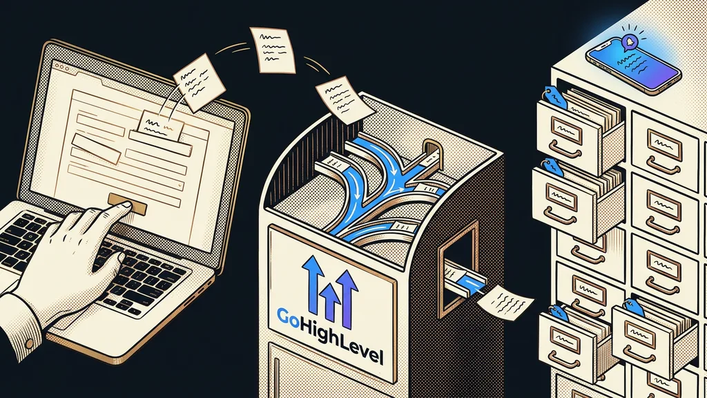
Before anything even makes it onto the list, the system reviews it on its own. So the client gets finished work rather than half-baked drafts. Approved items then go out and get scheduled on their own, so there’s no manual step between the decision and publication. The same rule applies here as with any work entrusted to a machine: responsibility stays with a person, which is why the decision has to be visible.
The trap that went unnoticed for five days
One silly mistake from all this I’ll remember forever. Logging in to the app failed for names with Czech accent marks, and because I tested it with a username that had none, nothing showed up for five days. Meanwhile, the client stayed silent, and I thought she just didn’t have time.
The lesson is a human one more than a technical one. Open every client app for the first time under the client’s name and in their browser instead of yours. And when a client doesn’t respond, start by asking whether they even got in, before you wonder why they haven’t decided.
Who your own approval page doesn’t pay off for
This isn’t for everyone. If you show a client two things a month, email is enough, and your own page would be extra work. It starts paying off once approvals happen regularly, there are more items each week, and each one waits for one specific yes.
It also won’t help where the client doesn’t decide alone. When someone else has the final say, the app won’t solve that. It will just show exactly where things got stuck, which, by the way, is useful too.
One last caveat: the app won’t improve the work you put into it. If a draft is bad, the client will just reject it faster and with less explaining.
The whole system in a nutshell
- A finished piece goes into the list with a title, a one-sentence brief, and a live preview.
- The client opens one address and sees only what’s waiting for their decision.
- They decide with one of four buttons, or send just a comment and leave it pending.
- Approved items go out on their own; returned ones get reworked and come back to the list.
- Each item keeps showing who decided and when.
Back to that one sentence I got in reply to three images and three questions. It’s gone, but the work didn’t shrink. It just moved to a place where it’s visible. A good client app pays off because no decision gets lost, more than because decisions get faster.